Cursor Logistic
Reimagining Logistics for a New Era
Cursor Logistics came to us with a bold vision: to evolve their digital presence and solidify their position as a leader in the logistics industry. With 15 years of excellence serving clients like NATO, the US Army Corps, and the United Nations, their visual identity needed to reflect the same trust, reliability, and professionalism that defined their operations. The challenge? To craft a brand and website that not only resonated with their core audience but also positioned them for future growth.
The result? A forward-thinking identity that inspired trust, professionalism, and authority. Within six months of launch, Cursor Logistics secured five national-level contracts and partnered with three international clients.
Scope
Brand Visual Identity
Logo Design
Marketing Materials
Website Development
Brand Guidelines
Brand Strategy Development
Challenge
Old logo
Cursor Logistics is no ordinary logistics company. For over 15 years, they’ve provided transportation and maintenance services for high-stakes organisations like the US Embassy and NATO. Yet, their visual identity didn’t reflect the trust and reliability they had earned. Despite a team of 230 professionals operating across five hubs, their website and brand felt outdated and didn’t resonate with the market they were ready to dominate. Cursor needed a transformation—not just visually but strategically.
Solution

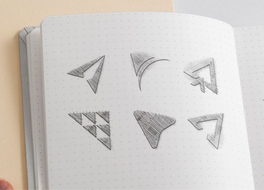
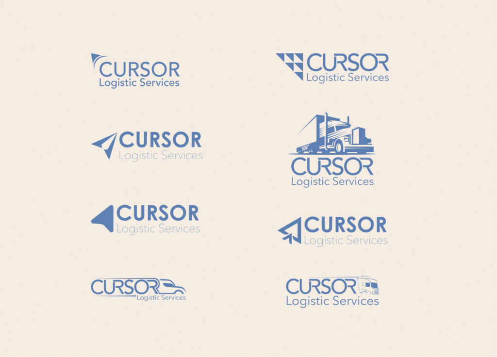
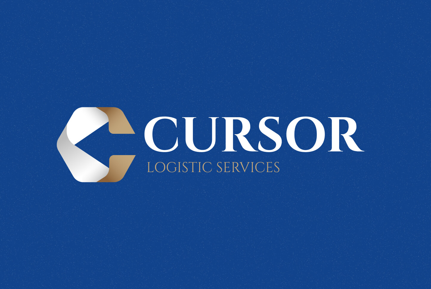
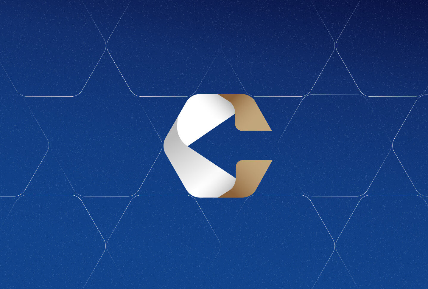
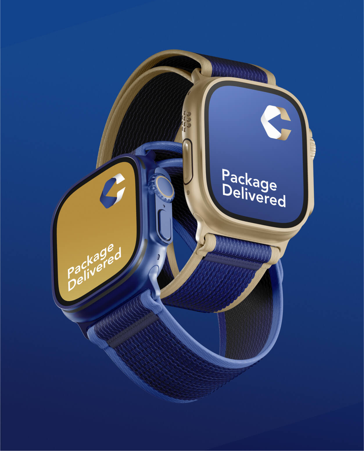
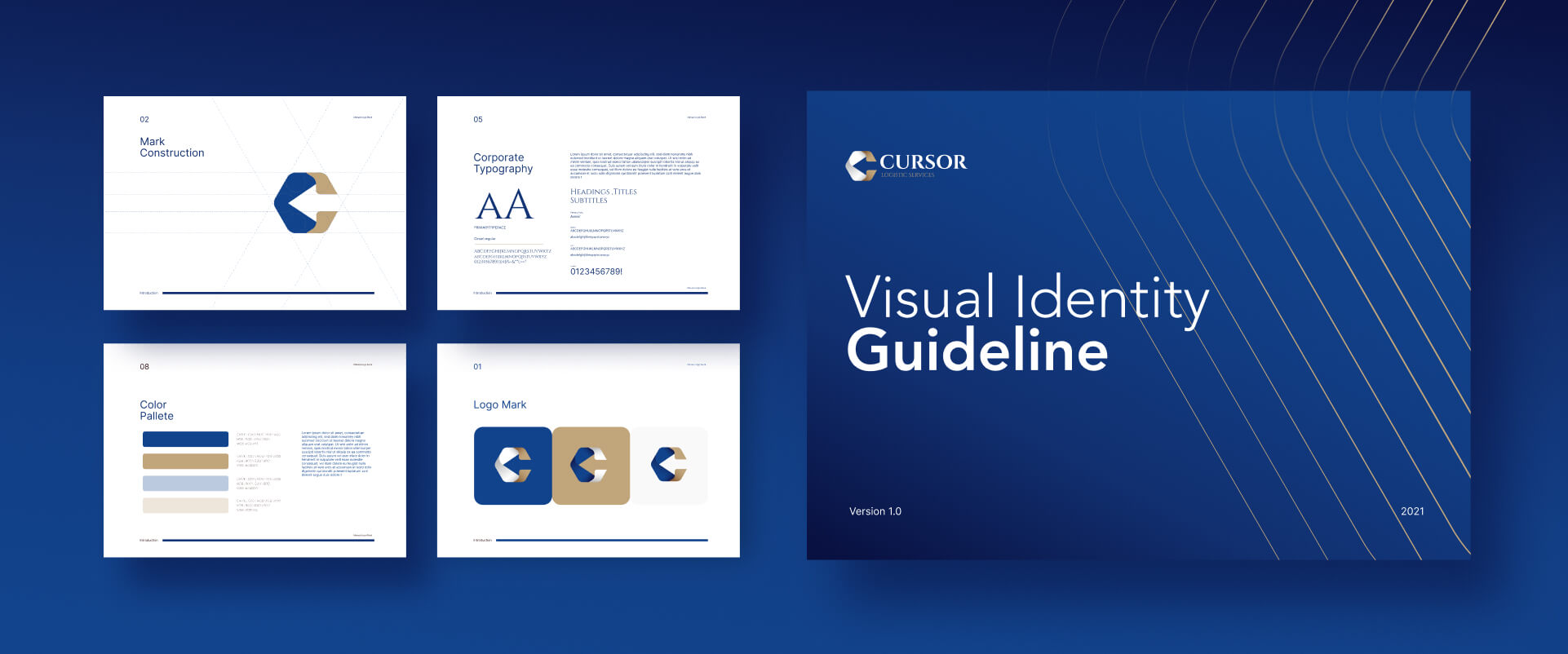
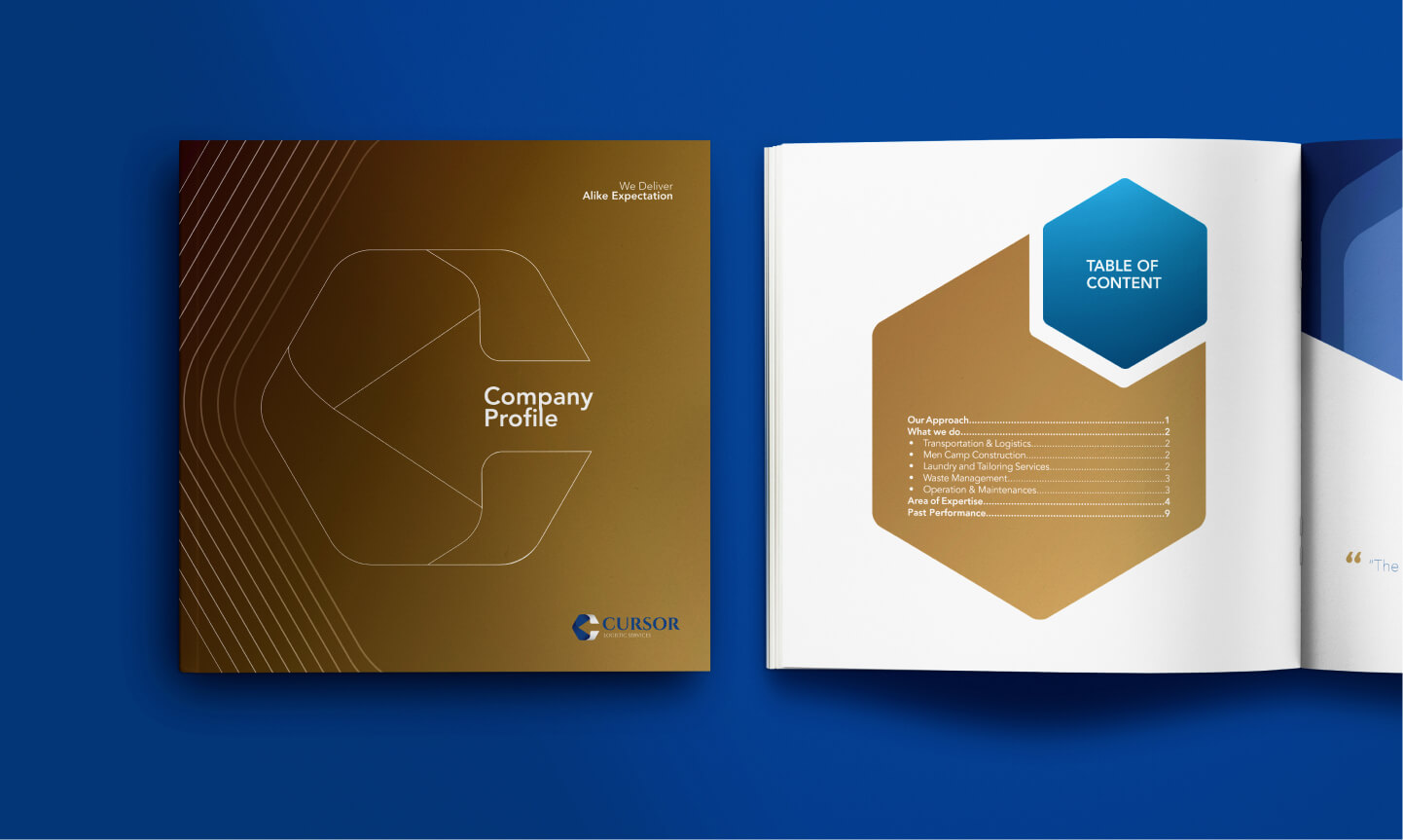
From day one, we knew Cursor needed more than a refreshed logo. Their brand had to tell a story of leadership, trust, and innovation. We conceptualised their visual identity around the idea of movement and progress—values core to Cursor’s DNA. The logo became a hexagonal form, symbolising stability and strength, with a cursor arrow cutting through it to represent direction, leadership, and their company name.
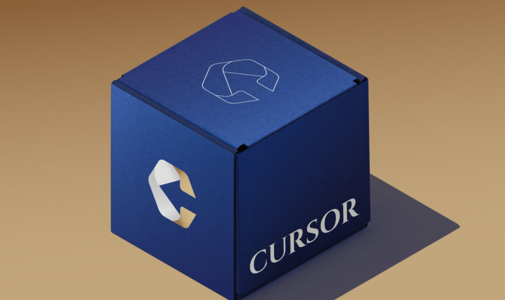
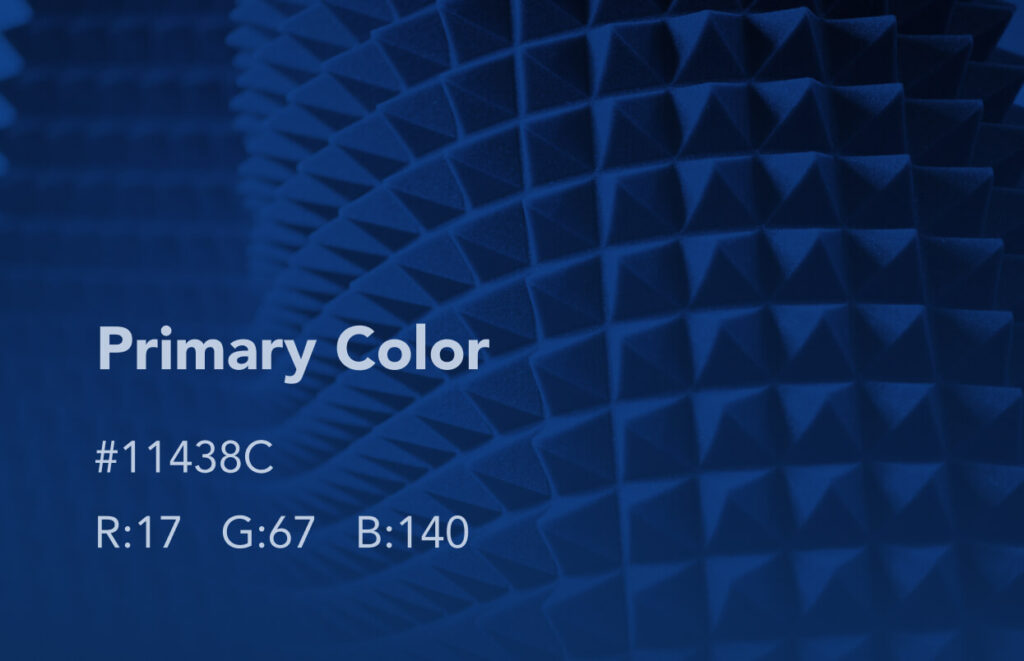
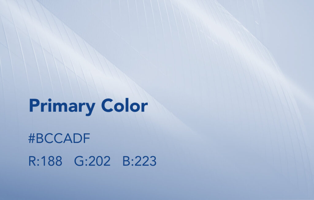
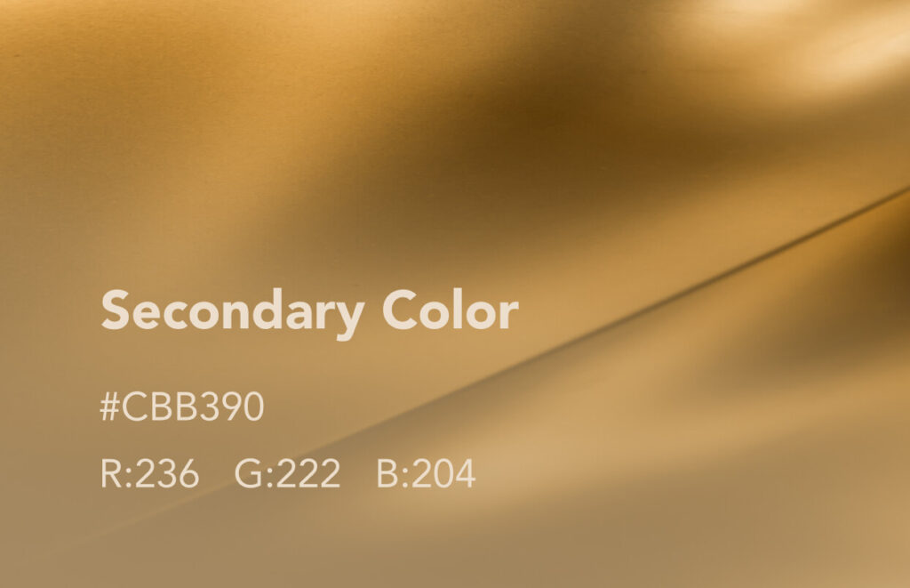
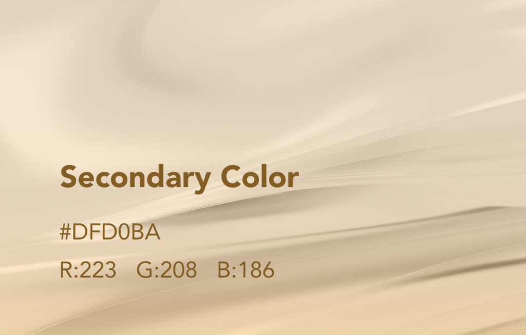
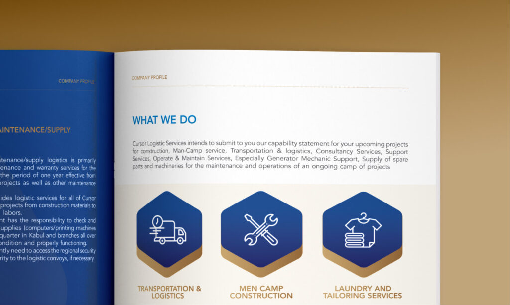
To complement the identity, we developed a colour palette of deep blue and gold—evoking professionalism and premium service. The visual identity came to life through dynamic patterns, print materials, and a redesigned website that seamlessly blended form with function.




Process
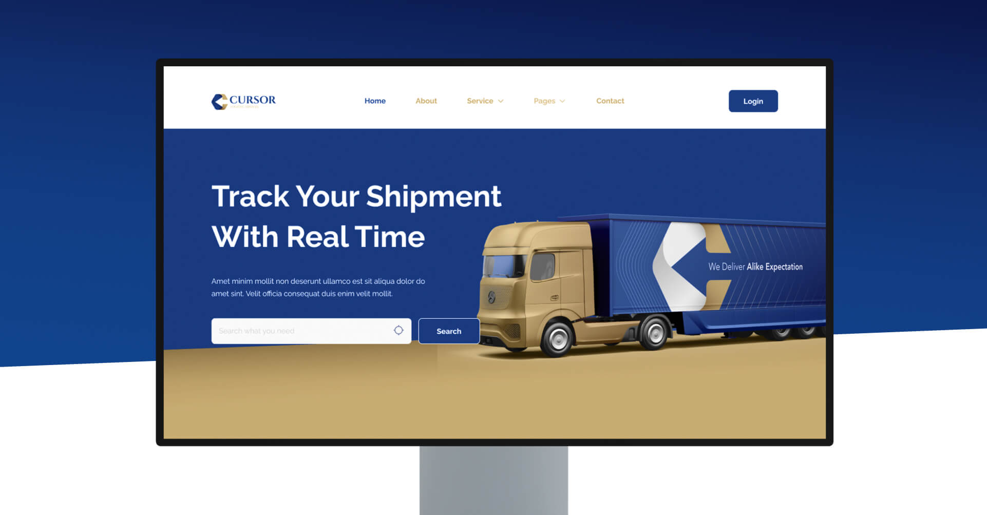
We believe that simplicity communicates better than complexity. For Cursor, this meant creating a website that didn’t just look sleek but made it effortless for users to understand who they are and what they offer. Instead of overloading users with text, we built an intuitive structure with strategically placed CTAs, making it easier for prospective clients to navigate their services and get in touch.
We didn’t just design a website; we built a platform that demonstrated Cursor’s core values of efficiency, reliability, and trustworthiness.

Outcome
Cursor’s ambitions don’t stop at being a leader in logistics today—they aim to be a game-changer in the next five years. Inspired by this vision, we positioned their new identity to stand out in national and regional markets. Every design decision—whether the hexagonal logo, the forward-arrow icon, or the premium colour palette—was crafted with scalability in mind, ensuring their brand evolves with them.
We didn’t just design a website; we built a platform that demonstrated Cursor’s core values of efficiency, reliability, and trustworthiness.
Impact
The transformation wasn’t just aesthetic, it was strategic. Within six months of the launch, Cursor Logistics won five national-level contracts, attracted three international partners, and reaffirmed their standing with existing clients. Their new digital presence has become a cornerstone of their success, drawing attention from top contractors and cementing Cursor’s reputation as a trusted logistics partner.
Have an idea to work together?
Book a Call with us